Special features
This page lists some additional features Pegasus provides for themes.
Blurhash
Blurhash is a way to generate placeholders for images by using a short string to represent them. For more details, as well as producing BlurHash strings, visit blurha.sh.
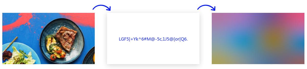
To use them in a theme, set an Image component's source field to a special format like this:
Image {
    source: "image://blurhash/" + encodeURIComponent(yourHash)
    width: someWidth
    height: someHeight
}
For example:
Image {
    source: "image://blurhash/" + encodeURIComponent("LEHV6nWB2yk8pyoJadR*.7kCMdnj")
    width: 300
    height: 200
}
encodeURIComponent
Technically the source field is an URI, and certain characters that BlurHash strings use, like % signs, are not allowed there. encodeURIComponent is a standard JavaScript function that encodes this string to a safe to use format.
sourceSize
By default the placeholder images are generated in a small resolution (24×24) then scaled to match the Image's size. If you wish to increase or decrease this internal resolution, you can use the Image's sourceSize property for that. Note that in most cases increasing this resolution does not produce better visual results.
Virtual screen coordinates
Deprecated
While the methods described here still work, in new themes you should write your own scaling function if necessary. To get the properties of the device's screen (eg. DPI), you can use the QML Screen object. To get the size of the window, you can check the width and height properties of your theme's root element (ie. the FocusScope), as it will be set to fill the whole window.
When you load a theme, its main component (the FocusScope above) will be set to fill the whole screen. The top left corner of the screen is (0,0), with the X axis growing right and the Y axis growing downwards.
While positioning elements on the screen, you should make sure that your theme works well with multiple aspect ratios and screen resolutions. Generally in QML this isn't hard because you can tell the position and size of elements compared to others using anchors (eg. align an element right above or below to another -- see the QML tutorials).
When you do have to position or size things manually, it is common to use percentages or create different themes for different aspect ratios. For better support of different screen sizes, Pegasus also provides an optional virtual coordinate system. You can treat the screen as one with the resolution of at least 1280x720 virtual pixels (16:9 aspect ratio), and use integer pixel values, which will then scale to the correct physical value according to the screen's real resolution.
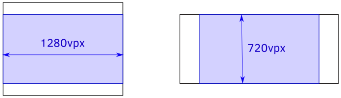
If the screen's aspect ratio is smaller than 16:9 (eg. 4:3 or 5:4), then the virtual screen will be taller than 720 virtual pixels, but still have 1280 as a fixed width. If the aspect ratio is wider (eg. 21:9), then the virtual height will remain to be 720, but the width will be bigger.
This system can be useful when you want to express precise details as integer values, like spacing, text sizes, width/height, etc. To use virtual pixel values, simply put your number inside a function called vpx. For example, instead of
width: 50
you would use
width: vpx(50)
which will turn into 50 real pixels on a 720p screen, scale up to 150px on a 4K TV, and scale down to 25px on a smaller 360p device.
Using virtual pixel values is optional, but often more intuitive than percentages with several digits of precision. Depending on your situations, you might prefer one over the other, or use both of them. Feel free to experiment!
Tip
Using the virtual coordinate system does not decrease image quality.