Simple theme, Part 2: Game details
Game information
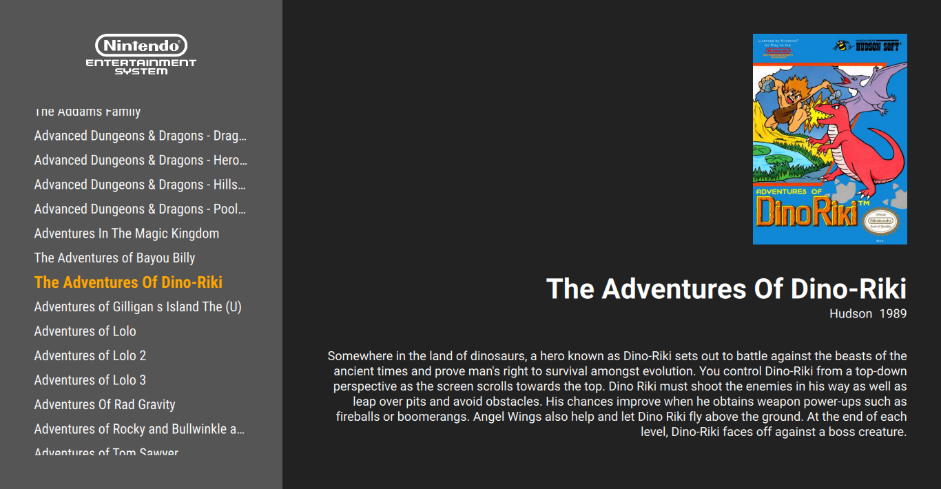
With the game selection menu done, let's continue with the right side of the theme, the game informations. Metadata and assets of the currently selected game will be shown here; unlike the dynamic menu, these will be simple Text and Image objects, with their content coming from the API. We'll show the following information, in order:
- box art
- game title
- developer and release year (in one row)
- game description

The current game
We can get the current game using the index provided by the game list ListView. Let's make a shortcut for it:
FocusScope {

    property int currentCollectionIndex: 0
    property var currentCollection: api.collections.get(currentCollectionIndex)
    property var currentGame: currentCollection.games.get(gameView.currentIndex)

    // ...
}
Help
I'm placing it at the top of the theme to make it accessible in all elements. If I'd place it in, for example, content, then I'd need to write content.currentGame. Use whichever you prefer.
Box art
Add an Image object to the right side panel, with its source set to the current game's box art asset. The image will take the upper half of the screen, with a 50px padding around. As the box arts of different games may have different shapes (portrait, landscape, extra wide, etc.), it might be useful to define the maximum area an image may take up, and fit them in this area.
Rectangle {
    id: content

    color: "#222"

    anchors.left: menu.right
    anchors.right: parent.right
    anchors.top: parent.top
    anchors.bottom: parent.bottom


    Image {
        id: cover

        anchors.top: parent.top
        anchors.right: parent.right
        anchors.left: parent.left
        anchors.margins: vpx(50)
        anchors.bottom: parent.verticalCenter
        anchors.bottomMargin: 0

        fillMode: Image.PreserveAspectFit
        horizontalAlignment: Image.AlignRight

        source: currentGame.assets.boxFront
        sourceSize { width: 1024; height: 1024 }
        asynchronous: true
    }
}
Box art images might be quite big in resolution, so this time I've also set sourceSize: it limits the maximum amount of memory the image will take up. If the image is larger than this, it will be scaled down, keeping the aspect ratio. In this particular case, I've set it to scale down to 1024 × 1024 pixels (taking up about/at most 1024 × 1024 × 3 bytes = 3 MiB space in the memory).
Column and Row
The QML Column and Row object are great tools for aligning a fixed number of elements. In this case, the box art and the further Text items could be put into a Column that would anchors.fill its parent with a 50px anchors.margin, so I wouldn't have to define it for the Image itself and the other Texts.
So why I didn't use it? Column and Row works the best when the spacing between the elements is the same, but in this theme, I'd like to set some custom spacing between the elements later.
An alternative would be to put the elements into an Item. Perhaps you might want to try it as a practice?
Title
The rest of the game informations will be simple Text objects. The only thing that needs more attention is that the texts may be too long to fit on the screen, so we'll define a text area (similarly to the box art), and hide what doesn't fit into them.
So, for the title:
Rectangle {
    id: content

    // ...

    Image { /* ... */ }


    Text {
        id: title

        text: currentGame.title
        // white, big bold sans-serif font
        color: "white"
        font.family: globalFonts.sans
        font.pixelSize: vpx(42)
        font.bold: true

        horizontalAlignment: Text.AlignRight
        // if it's too long, end it with an ellipsis
        elide: Text.ElideRight

        // 40px below the box art
        anchors.top: cover.bottom
        anchors.topMargin: vpx(40)
        // left and right edges same as the image
        anchors.left: cover.left
        anchors.right: cover.right
    }
}
Developer and release
I'll put two Text items in a Row, and move the Row under the title. I didn't bother wth a maximum text width here, as company names tend to be not too long, while the release year should be just four numbers.
The code:
Rectangle {
    id: content

    // ...

    Row {
        id: shortInfo

        anchors.top: title.bottom
        anchors.right: title.right

        spacing: vpx(10)


        Text {
            text: currentGame.developer
            color: "white"
            font.pixelSize: vpx(18)
            font.family: globalFonts.sans
        }

        Text {
            text: currentGame.year
            color: "white"
            font.pixelSize: vpx(18)
            font.family: globalFonts.sans
            visible: currentGame.year > 0 // !!
        }
    }

}
Note that I only show the year when it's greater than 0. If we have no information about when the game was released, <Game>.year will be 0, which looks silly on the screen.
Description
A multiline text area. If the game has a short summary, it'll show that, otherwise the detailed description (or stay empty if none is available).
Rectangle {
    id: content

    // ...

    Text {
        id: description

        text: currentGame.summary || currentGame.description
        color: "white"
        font.pixelSize: vpx(18)
        font.family: globalFonts.sans

        wrapMode: Text.WordWrap
        horizontalAlignment: Text.AlignRight
        elide: Text.ElideRight

        anchors.top: shortInfo.bottom
        anchors.topMargin: vpx(40)
        anchors.bottom: parent.bottom
        anchors.bottomMargin: vpx(50)
        anchors.left: cover.left
        anchors.right: cover.right
    }
}
Conclusion
With all these changes, our theme is now complete and should look like this:
Sure, perhaps not the most attractive yet, but I hope it helped learning theme creation. Feel free to tweak it to you liking, or make a new one based on it. Have fun!