Simple theme, Part 2: Collections and the game list
Left panel
Let's continue with the menu panel, as this will be the more complex part of the theme.
I'd like to add a 50px padding around the contents of the left panel. But the players have all kinds of screens and devices, with larger or smaller resolutions -- how can I define it in a resolution-independent way?
You can define values using percentages, like we did with the width earlier, but for cases where more precision is desired, the vpx function might be of use. These virtual pixel values will automatically scale up or down depending on the screen resolution: a vpx(60) value will turn into 60px on a 720p screen, 90 real pixels on 1080p and 40 on 480p, while keeping the aspect ratio. Combining them with anchors and regular percentages, you can define and position elements in a quite detailed way.
So, I want to add a 50px padding for the items -- and by this, I mean a padding that will be 50px on a screen with 1280x720 resolution, and scale up or down for other sizes. For later use, I'll store the amount of the remaining "content width" in a property:
Rectangle {
    id: menu

    property real contentWidth: width - vpx(100)

    color: "#555"

    width: parent.width * 0.3
    anchors.top: parent.top
    anchors.bottom: parent.bottom
}
The current collection
Pegasus provides access to the collections using api.collections (reference). This is a list of items, and we can access one item in it by the item's position ("index") (see the get function). Let's create a property for tracking the current collection. Just for testing, I'll set it to the very first collection item, then we'll implement collection changing later.
import QtQuick 2.0

FocusScope {

    property var currentCollection: api.collections.get(0)

    // ...
}
Collection logo
Lets add the collection's logo to the panel. First you'll need a bunch of game system logo images. I've borrowed them from EmulationStation (original: Nils Bonenberger, CC-BY-NC-SA), except the RetroPie logo (original: Florian Müller, CC-BY-NC-SA). You can get them here. The file names match the system names from EmulationStation. Simply create a new directory inside your theme's folder, eg. assets, and extract them there.
After that, I add an Image element inside the menu Rectangle:
Rectangle {
    id: menu

    property real contentWidth: width - vpx(100)

    color: "#555"

    width: parent.width * 0.3
    anchors.top: parent.top
    anchors.bottom: parent.bottom

    Image {
        id: collectionLogo

        width: parent.contentWidth
        height: vpx(60)

        fillMode: Image.PreserveAspectFit
        source: "assets/" + currentCollection.shortName + ".svg"
        asynchronous: true

        anchors.horizontalCenter: parent.horizontalCenter
        anchors.top: parent.top
        anchors.topMargin: vpx(50)
    }
}
Some interesting things here:
sourceis the concatenation of three strings,shortNamebeing the short name for a collection (eg.nes,gba, ...).asynchronouswill load the image in the background. By default (false), the program will wait until the Image is fully loaded, but during this time it cannot respond to user input. Since images may take a long time to load depending on the device, asynchronous loading is preferred in most cases.
Changing collections
Pressing left or right feels kind of natural to use for selecting the next/previous collection. I'll add a new property to track the index of the current collection, starting with 0 initially. Then I handle of the Left and Right keys at the top of the whole FocusScope; I have to make sure the index doesn't turn negative or go over the highest index (count - 1); when they would, I restart the counting from the other end, which will produce a looping effect. I can do this with some JavaScript logic:
import QtQuick 2.0

FocusScope {

    property int currentCollectionIndex: 0
    property var currentCollection: api.collections.get(currentCollectionIndex)

    // decrease (and possibly loop) the collection index
    Keys.onLeftPressed: {
        if (currentCollectionIndex <= 0)
            currentCollectionIndex = api.collections.count - 1;
        else
            currentCollectionIndex--;
    }

    // increase (and possibly loop) the collection index
    Keys.onRightPressed: {
        if (currentCollectionIndex >= api.collections.count - 1)
            currentCollectionIndex = 0;
        else
            currentCollectionIndex++;
    }


    Rectangle {
        // ...
    }

    Rectangle {
        // ...
    }
}
After a refresh, pressing Left and Right should now change the logo on the screen. Yay!
Note
Assuming you have more than one collection, of course.
Tip
Handling keyboard keys also enables gamepad navigation. See the controls page about how keys and buttons are related.
Tip
Often there are more than one way to solve problems. Instead of manually handling the collection index, I could have used a ListView. We do that in the Flixnet tutorial, and also for the game list.
Game list
This is going to be actually the most complex piece of the theme. The games for the currently selected collection can be accessed through currentCollection.games, which is, similarly to the collections, a list containing games. This time we'll use a ListView that will create the menu entries and handle the index for us.
Returning to the menu Rectangle, I add a ListView after the logo, first setting just the dimensions:
Rectangle {
    id: menu

    // ...

    Image { /* ... */ }


    ListView {
        id: gameView

        width: parent.contentWidth
        anchors.horizontalCenter: parent.horizontalCenter
        anchors.top: collectionLogo.bottom
        anchors.bottom: parent.bottom
        anchors.margins: vpx(50)

        focus: true
    }
}
Now to actually see something, ListView needs a Model: a list of items, and a Delegate: the definition of how one item should look like on the screen.
Our model will be the games of the currently selected collection, and for every game, the visual representation will be a text item:
ListView {
    id: gameView

    model: currentCollection.games
    delegate: Text {
        text: modelData.title
    }

    // anchors, etc.
}
You should now see the list of games, changing with the selected collection on pressing Left/Right.
Note
games is a list of Game objects. modelData in the delegate will be one Game object of the Model.
I'll do a quick reorganization in the code:
- I move the Delegate definition to a separate object to make the code cleaner
Rectangle {
    id: menu

    // ...

    Image { /* ... */ }


    ListView {
        id: gameView

        model: currentCollection.games
        delegate: gameViewDelegate

        width: parent.contentWidth
        anchors.horizontalCenter: parent.horizontalCenter
        anchors.top: collectionLogo.bottom
        anchors.bottom: parent.bottom
        anchors.margins: vpx(50)

        focus: true
    }

    Component {
        id: gameViewDelegate

        Text {
            text: modelData.title
        }
    }
}
Tip
Component is a special element that defines a QML document. Just as QML files can have only one root element, Components can have only one child. You could actually move the Text to a separate file (eg. GameListItem.qml) and use the file's name to set the delegate (eg. delegate: GameListItem { }).
Let's continue with tweaking the menu items:
Component {
    id: gameViewDelegate

    Text {
        text: modelData.title

        // white, 20px, condensed font
        color: "white"
        font.family: globalFonts.condensed
        font.pixelSize: vpx(20)

        // the size of the whole text box,
        // a bit taller than the text size for a nice padding
        width: ListView.view.width
        height: vpx(36)
        // align the text vertically in the middle of the text area
        verticalAlignment: Text.AlignVCenter
        // if the text is too long, end it with ellipsis (three dots)
        elide: Text.ElideRight
    }
}
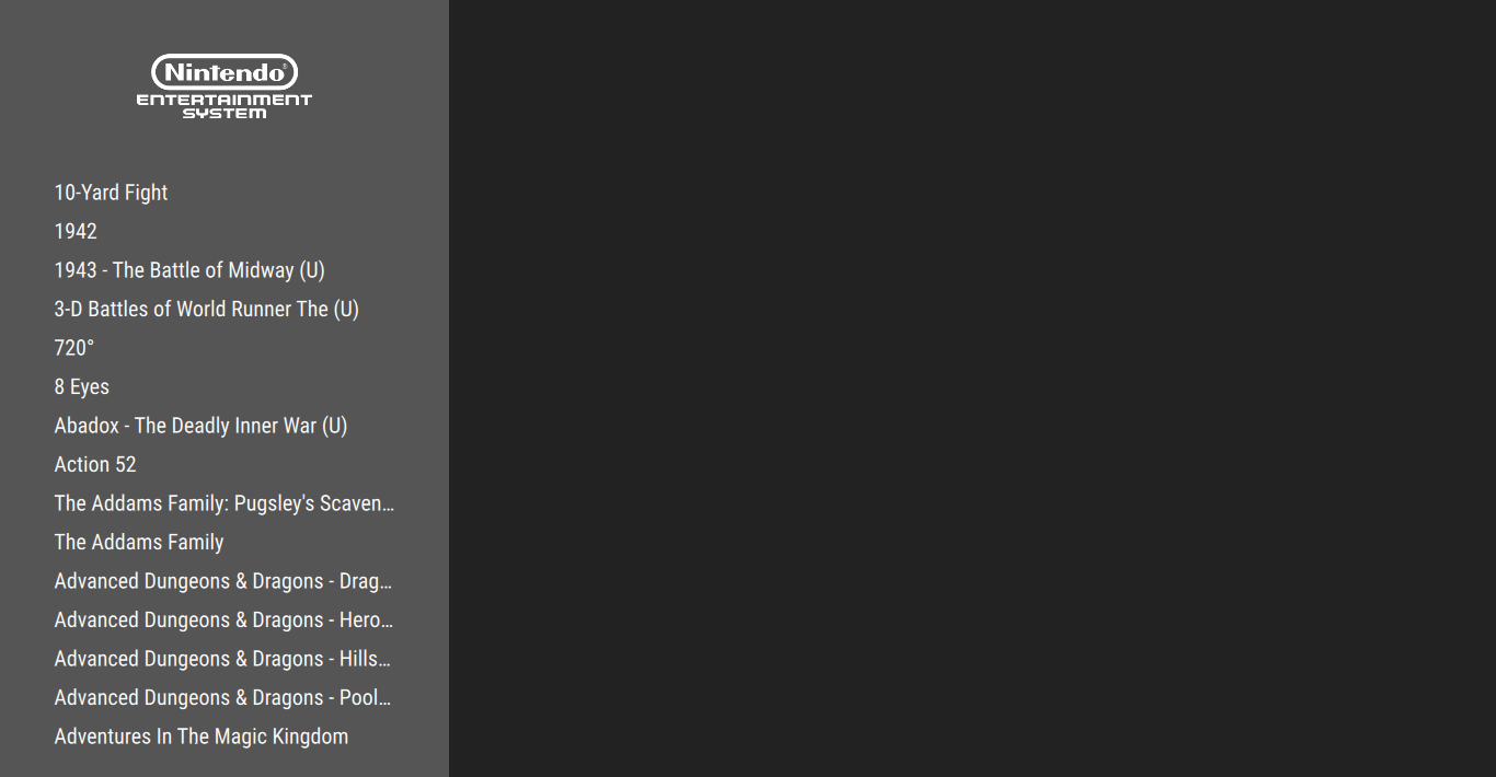
This is how it should look like:
To see which one of the menu items is the selected one, I'll change its color and make it bigger and bold:
Component {
    id: gameViewDelegate

    Text {
        text: modelData.title

        // orange if this item is the currently selected one, white otherwise
        color: ListView.isCurrentItem ? "orange" : "white"
        font.family: globalFonts.condensed
        // bigger if selected
        font.pixelSize: ListView.isCurrentItem ? vpx(24) : vpx(20)
        // bold if selected (hint: isCurrentItem is already a true/false value)
        font.bold: ListView.isCurrentItem

        width: ListView.view.width
        height: vpx(36)
        verticalAlignment: Text.AlignVCenter
        elide: Text.ElideRight
    }
}
Help
When setting values, the X ? A : B form is called "inline-if": if the condition X is true, A will be used, otherwise B. In our case, it would equal to the following JavaScript code:
if (ListView.isCurrentItem)
    return "orange"
else
    return "white"
(which you can also use, if you wish).
The list should now scroll around with a visible highlight for the current selection.
Launching games
The last feature required to make our theme functional is launching games. Game objects from the API have a launch() command you can use. Simply call it on the game list delegate, for example on Enter:
Component {
    id: gameViewDelegate

    Text {
        // ...

        Keys.onReturnPressed: modelData.launch()
    }
}
Help
Technically the Enter next to the letter keys is called "Return", and the one on the numeric pad is "Enter". Careful not to mix them up.
And with this, we have a functional theme!
Tweaks
Some additional (and optional) graphical tweaks to try out for extra fancyness.
Clipping
While scrolling, you might have noticed that items at the top and the bottom of the list seem to go out of the bounds of the ListView's area. Delegates are fully drawn on the screen if they are at least partially visible; to make sure nothing shows up outside the ListView's area, you can use the clip property:
ListView {
    id: gameView

    // ...

    focus: true
    clip: true
}
Now the ListView will cut the drawing at its borders.
Centering the current item
It'd be nice if the currently selected item would try to stay in the middle of the list:
We can set this by defining the "highlight range"; the ListView will then try to scroll the list so the currently selected item falls into this range.
The highlight range is defined by the start and end position. For our vertical ListView, these are the distances from the top edge of the item, in pixels. We can get the vertical center of the ListView simply as height / 2, and the height of one Text item was set to 36px previously. To position it exactly in the middle, I'll set the start of the range 18px above the center, and end it 18px below.
ListView {
    id: gameView

    // ...

    highlightRangeMode: ListView.ApplyRange
    preferredHighlightBegin: height * 0.5 - vpx(18)
    preferredHighlightEnd: height * 0.5 + vpx(18)
}
which should give the desired result.
However, when you change the collection, there is a few seconds of scrolling to the index of the newly selected game list. To disable this, and jump to the selected item instantly, set animation duration to zero:
ListView {
    id: gameView

    // ...

    highlightRangeMode: ListView.ApplyRange
    highlightMoveDuration: 0
    preferredHighlightBegin: height * 0.5 - vpx(18)
    preferredHighlightEnd: height * 0.5 + vpx(18)
}