Flixnet theme, Part 4: Making things pretty
In this chapter, we'll try to make the game cells look better!
Fancy game boxes
I'll now replace the green game boxes with something better to look at. There are two main cases we have to support:
- if there is an available image for a game, the box should show that
- if there is none, or the image has not loaded yet, the box should show a gray rectangle, with the game's title in the center
So gameAxisDelegate is our game box that right now contains a green rectangle. I'll turn that into an Item, and, for the two cases above, I'll add an initial gray Rectangle and Image:
Component {
    id: gameAxisDelegate

    Item {
        width: vpx(240)
        height: vpx(135)

        Rectangle {
            anchors.fill: parent
            color: "#333"
        }

        Image {
            id: image

            anchors.fill: parent
        }
    }
}
So which image asset should we use? A game box is a rectangle with 16:9 aspect ratio, so the banner would be perfect for this. However, since every asset is potentially missing, we should consider showing other images and provide multiple fallbacks. If we don't have a banner, the next similarly sized one is the steam ("grid icon") asset. Because it's wider than 16:9, we'll need to crop it if we don't want black bars or squashed/stretched images (though you might prefer that). If neither image is available, I'll use boxFront as it tends to be commonly available.
Let's extend the Image object created previously:
Image {
    id: image

    anchors.fill: parent
    visible: source

    // fill the whole area, cropping what lies outside
    fillMode: Image.PreserveAspectCrop

    asynchronous: true
    source: assets.banner || assets.steam || assets.boxFront
    sourceSize { width: 256; height: 256 }
}
I've also made some optimizations here:
- I've set
asynchronous: true: Loading image files takes some time depending on the device Pegasus runs on. If this property is set to false (default), the program will not react to input until the image is loaded (or noticed that it failed to load). If it's false, the image is loaded "in the background", and input is not blocked; hovewer depending on your theme, you might want to show something in its place for the users during this time (eg. a loading spinner or progress bar). - I've set
sourceSize: This sets the maximum size the image should occupy in the memory. The official documentation describes this in detail. - I've set
visible: source, that is, if thesourceis empty (neitherbanner,steamorboxFrontis available), then ignore this whole object: no input will be ever handled here and there's nothing to see either.
With these changes, here's how it looks:
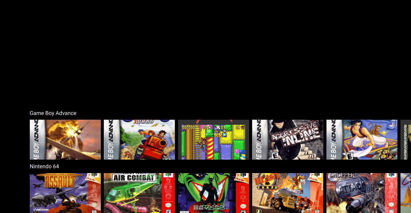
Starting to take shape, isn't it?
Let's finish the text-only fallback too:
Component {
    id: gameAxisDelegate

    Item {
        width: vpx(240)
        height: vpx(135)

        Rectangle {
            anchors.fill: parent
            color: "#333"
            visible: image.status !== Image.Ready

            Text {
                text: modelData.title

                // define the text area
                anchors.fill: parent
                anchors.margins: vpx(12)

                // align to the center
                horizontalAlignment: Text.AlignHCenter
                verticalAlignment: Text.AlignVCenter
                wrapMode: Text.Wrap

                // set the font
                color: "white"
                font.pixelSize: vpx(16)
                font.family: globalFonts.sans
            }
        }

        Image {
            id: image

            // ...
        }
    }
}
And we're done with the game boxes!
Looping the axes
It'd be nice if all of the lists would loop around. You can do two kinds of loop:
- make the list finite and when the last item is reached, jump back to the first one (and also in reverse direction)
- make the list infinite and loop around (carousel style)
The first one can be done either by simply setting keyNavigationWraps: true for a ListView (and other Views) or using the API's default index increase/decrease functions. In our case though, the carousel option would look the best.
I won't lie, making a carousel-like looping list is annoying and overly complex for this use case; the situation might improve later by creating some easier-to-use custom types in Pegasus.
Vertically
So the problem is, ListView can't do carousels: the only type that can is PathView. As such, we'll turn our ListViews into PathViews next. Again, let's start with the vertical axis; here's a before-after comparison, with some comments after the code:
Before
ListView {
    id: collectionAxis

    anchors.left: parent.left
    anchors.right: parent.right
    anchors.top: parent.verticalCenter
    anchors.bottom: parent.bottom

    model: api.collections
    delegate: collectionAxisDelegate

    snapMode: ListView.SnapOneItem
    highlightRangeMode: ListView.StrictlyEnforceRange
    clip: true

    focus: true
    Keys.onLeftPressed: currentItem.axis.decrementCurrentIndex()
    Keys.onRightPressed: currentItem.axis.incrementCurrentIndex()
    Keys.onPressed: {
        if (api.keys.isAccept(event))
            currentItem.axis.currentGame.launch();
    }
}
After
PathView {
    id: collectionAxis

    anchors.left: parent.left
    anchors.right: parent.right
    anchors.top: parent.verticalCenter
    anchors.bottom: parent.bottom

    model: api.collections
    delegate: collectionAxisDelegate


    // changed ListView to PathView
    snapMode: PathView.SnapOneItem
    highlightRangeMode: PathView.StrictlyEnforceRange
    clip: true

    // brand new: path definitions
    pathItemCount: 1 + Math.ceil(height / vpx(180))
    path: Path {
        startX: collectionAxis.width * 0.5
        startY: vpx(180) * -0.5
        PathLine {
            x: collectionAxis.path.startX
            y: collectionAxis.path.startY + collectionAxis.pathItemCount * vpx(180)
        }
    }
    preferredHighlightBegin: 1 / pathItemCount
    preferredHighlightEnd: preferredHighlightBegin


    focus: true
    // added up/down navigation
    Keys.onUpPressed: decrementCurrentIndex()
    Keys.onDownPressed: incrementCurrentIndex()
    Keys.onLeftPressed: currentItem.axis.decrementCurrentIndex()
    Keys.onRightPressed: currentItem.axis.incrementCurrentIndex()
    Keys.onPressed: {
        if (api.keys.isAccept(event))
            currentItem.axis.currentGame.launch();
    }
}
Warning
Don't forget to change ListView to PathView in the delegate (collectionAxisDelegate's width prop) too!
Structure of the vertical PathView. The red line marks the path, with red dots at positions 0/4 (top), 1/4, 2/4, 3/4 and 4/4 (bottom). The centers of the delegates are marked with blue.
Unlike ListView that goes to one direction only, PathView can be used to create arbitrary paths on which the items will travel (curves, circles, all kinds of shapes). Because of that, some properties have to be provided in percentage or need manual calculations.
For PathViews,
pathItemCountmust be set (the default behaviour is to show all items). We should show as many rows as it fits into lower half or the screen (one row's height is 180px). The number of visible items thus will be [area height] / [row height], which I've rounded up usingMath.ceil, a standard JavaScript function. However, when there's a scrolling going on, there'll be actually one more row visible on the screen: the topmost row will gradually go out on the top of the lower area, while a new line is on its way in to appear on the bottom (see the animation below).The
pathdefines the trail the elements will follow by their center point. Because there'll be one item that slides out, and one that slides in, the path extends above and below the PathView's area. The starting point of the axis (the center point of the item that will slide out) is horizontally (startX) the center of the screen (as the rows fill the width), and vertically (startY) above the top edge of the PathView (which would be 0) by 50% of the row height (where values are in pixels). From the start point, a linear path is created withPathLine: I've set it so the end point is the same as the start except theYcoordinate, which is increased by the length ot the path, [number of max. visible items] * [item height].The preferred highlight positions are in percentage for the PathView (as it can have any kind of shape, pixels don't always make sense). Again, the values define the range for the center point of the selected item. It defaults to 0 (start of the line), which in our case would be the center of the sliding out element, out of the visible area. I've set it to [1] / [item count], which will produce the center point of the second element on the path. Since I'm not planning to add any additional effects and such, just select one item, I've set the end of the range to the same as the beginning.
Because Paths are not necessary straight, it can't be decided automatically which direction are logical to move in, so there's no built-in key navigation. In our case we're just moving vertically, so I've made the View react to the "up" and "down" keys.
Horizontally
The horizontal scrolling works similarly, with one important difference: there is a margin on the left of the currently selected item, where the previous one is halfway in the screen. We'll have to shift the whole path horizontally, and add 1 to the maximum number of visible items, and another one to account for scrolling, just like at the vertical axis.
I've set the left margin previously to 100 px and the width of a game box to be 240x135. In addition, there's a 10px spacing between the elements, giving the full width of a box to 250. The center of the current-item would be at 100 + 250/2 = 225 on the path, but to make it align with the collection label, I'll shift it 5px (half of the spacing) to the left, making the X center to be 220px. Then counting backwards, the previous-item will be at 220 - 250, and the one before that (the leftmost position, where the new elements will appear when scrolling) at 220 - 250 * 2.
All right, let's change the horizontal ListView into a PathView:
Before:
ListView {
    id: gameAxis

    anchors.left: parent.left
    anchors.right: parent.right
    anchors.top: label.bottom
    anchors.bottom: parent.bottom

    orientation: ListView.Horizontal

    model: modelData.gameList.model
    currentIndex: modelData.gameList.index
    delegate: gameAxisDelegate
    spacing: vpx(10)

    snapMode: ListView.SnapOneItem
    highlightRangeMode: ListView.StrictlyEnforceRange

    preferredHighlightBegin: vpx(100)
    preferredHighlightEnd: preferredHighlightBegin + vpx(240)
}
After:
PathView {
    id: gameAxis

    anchors.left: parent.left
    anchors.right: parent.right
    anchors.top: label.bottom
    anchors.bottom: parent.bottom

    // removed orientation

    // removed spacing
    model: modelData.gameList.model
    currentIndex: modelData.gameList.index
    delegate: gameAxisDelegate

    // changed ListView to PathView
    snapMode: PathView.SnapOneItem
    highlightRangeMode: PathView.StrictlyEnforceRange


    // brand new: path definitions
    pathItemCount: 2 + Math.ceil(width / vpx(250)) // note the '2'!
    path: Path {
        startX: vpx(220) - vpx(250) * 2
        startY: vpx(135) * 0.5
        PathLine {
            x: gameAxis.path.startX + gameAxis.pathItemCount * vpx(250)
            y: gameAxis.path.startY
        }
    }
    // changed highlight range
    preferredHighlightBegin: 2 / pathItemCount
    preferredHighlightEnd: preferredHighlightBegin
}
And now both the horizontal and vertical axis loops as intended!
Tip
Typing out fixed values in pixels every time can be tedious and error prone. I'd recommend defining them as properties at the top of the object they're used in (eg. property real boxHeight: vpx(135)).